A place to begin
Watercolor history includes meticulous studies, private sketches, and ambitious exhibition pictures. “Loose and pale” is only one part of the story.
Watercolor is often introduced as a portable way to sketch. That is one use, but it leaves out much of the medium’s history. Artists have used it to study a patch of grass, describe an unfamiliar place, and make pictures intended for public exhibition.
This is a short introduction to selected European and American developments, not a complete history of water-based painting around the world. Read it as a set of stopping points, with museum links you can follow when a particular work catches your attention.
The Renaissance: a close look at the natural world
Albrecht Dürer’s Young Hare, dated 1502, is an early reminder that water-based painting can be extraordinarily precise. The ALBERTINA records watercolor and opaque colors, with white highlights, among its materials. View the museum record.
Rather than treating this work as proof that watercolor must look one particular way, notice how its mixed materials complicate the category. The question “is it watercolor?” can have a more interesting answer than a simple transparent-paint rule.
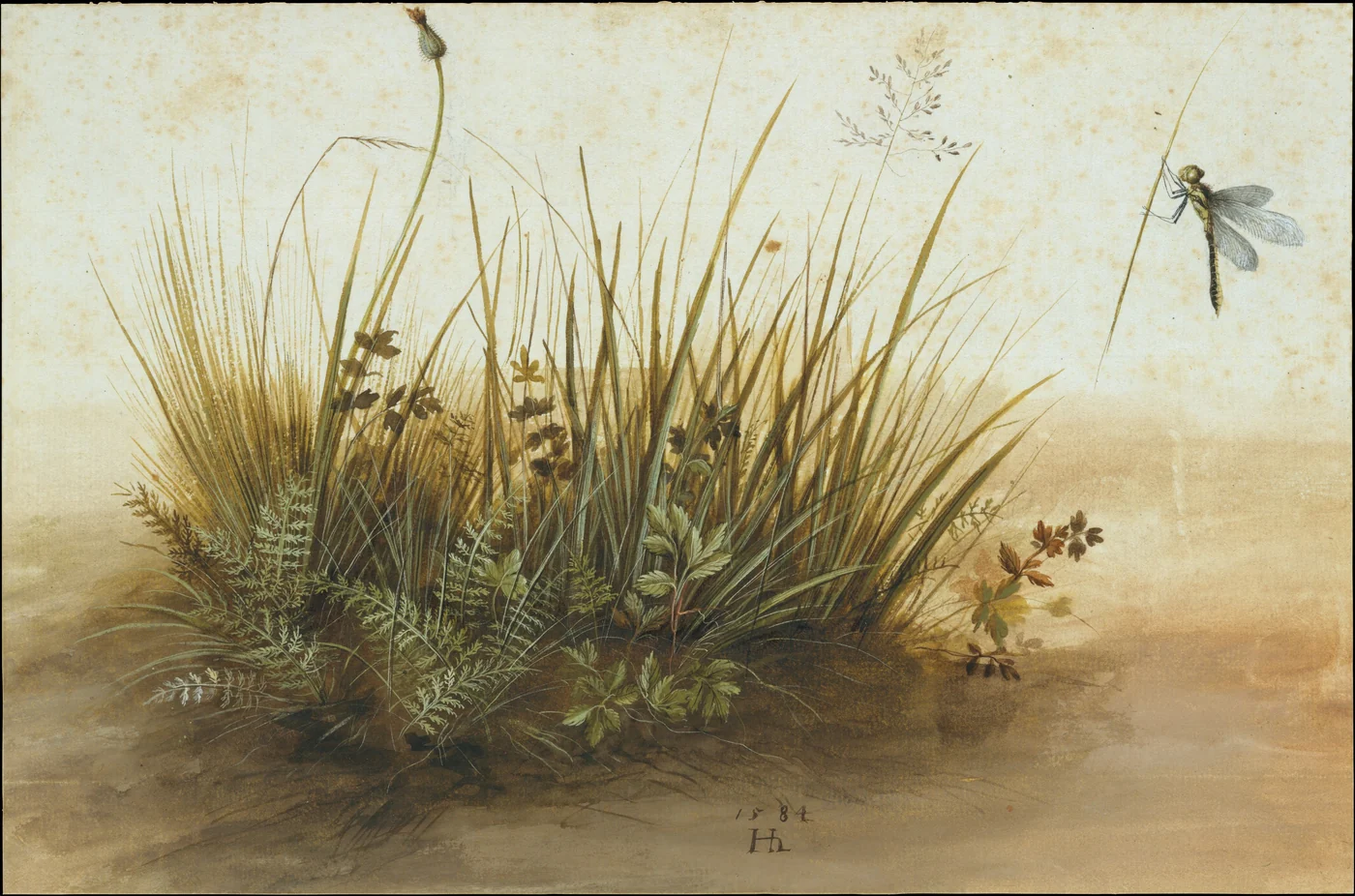
A later example is Hans Hoffmann’s A Small Piece of Turf of 1584. The Met identifies watercolor and gouache over charcoal. It makes a small fragment of vegetation the central subject. The Met’s object record.
A small subject, carefully observed
Travel views and the value of a drawing
By the eighteenth century, tinted drawings could serve as records of places and journeys. The V&A discusses William Pars’s work for a patron travelling in Ireland and the later museum distinction between such drawings and exhibition paintings. V&A: What is watercolour?.
Consider the difference between making a page for yourself, for a patron, and for a gallery wall. The same broad family of materials can serve each purpose, but the intended audience changes how we encounter the picture.
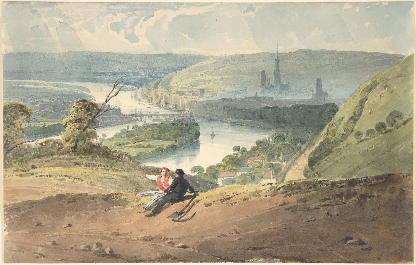
Richard Parkes Bonington’s Rouen, View from Bon-Secours, shown above, is dated 1821–22. Its museum record lists watercolor, ink, and graphite. That mixture is worth remembering whenever a modern materials list makes combinations seem like a recent invention. View the record.
1804: artists organize around watercolor
The Royal Watercolour Society traces its origin to the Society of Painters in Water Colours in 1804. Its history describes artists’ dissatisfaction with their treatment by the Royal Academy and a meeting on 30 November at the Stratford Coffee House in London. Royal Watercolour Society: Our History.
This is a useful point in the story because it concerns opportunity as well as technique. Artists wanted places to show their work and audiences prepared to take it seriously. The history of a medium is partly the history of how it gets seen.
For a present-day reader, that makes “just a watercolor” an unhelpful description. Scale, purpose, and ambition cannot be inferred from the name of the paint alone.
The nineteenth century: atmosphere and exhibition
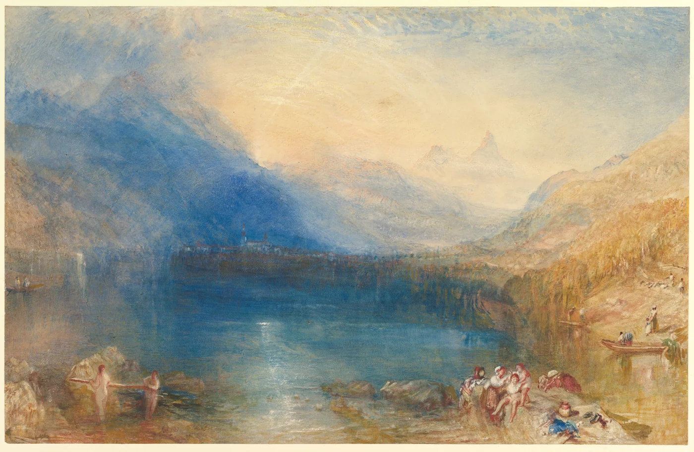
Turner’s The Lake of Zug dates to 1843. The Met lists watercolor, gouache, graphite, and techniques that remove paint from the surface. It is a particularly useful example of how a luminous landscape can have a complex material description. The Met’s record.
At the South Kensington Museum, now the V&A, collecting watercolors was part of the institution’s early ambitions after opening in 1857. Later collecting also brought private studies into public view. Museum taste helped shape which kinds of watercolor audiences valued. V&A collection history.
A later American example: Winslow Homer
Winslow Homer’s Flower Garden and Bungalow, Bermuda was made in 1899. The Met describes it as part of a group of tropical watercolors that was exhibited in 1901 and later acquired by the museum. View the work and its history.
Place that bright garden beside Hoffmann’s isolated plants or Bonington’s distant city. The comparison gives you three different reasons to use watercolor: concentrated observation, a view across space, and a strong arrangement of color.
Those are our suggested ways of looking, rather than claims about a single intention shared by the artists.
How to continue exploring
Choose one work and follow its museum record. Read the materials line as carefully as the title. Look for the date, dimensions, and whether the image includes pencil, ink, or opaque color.
Then compare a second work on one question only: how does each artist handle a bright area, a distant shape, or a tiny detail? A narrow comparison is easier to remember than a long list of names.
Our five-painting gallery gives you a place to begin. If the material names are unfamiliar, start with what watercolor is and our watercolor and gouache comparison.
Words and ideas from InklessEdit. Read our editorial approach.
← Back to the journal